5 Home-page Design Tips Everyone should know
Designing your front page ( Home-Page ) is very important, as it is one of the most important steps in designing a professional website. In this article on MyAdviseNow (MAN) website, you will read the main points in designing a home page.
But behind the design of the Home-Page of the site, there is a philosophy and a reason, or at least there should be. This is the first-page design of your site that persuades most visitors to go to other pages of your site. This is the main door of the house, which indicates and represents the situation inside the house. This rule applies to all online businesses.
Think about your web browsing habits. What happens when you see a bad front page on a website? You will probably hit the back key quickly.
So let’s talk about improving the design of the site’s front page. Below are 5 of the best things to do (from how to write posts to persuading visitors to go to the next step with an example).
Your site’s Home-Page design should:
Make it clear who you are and what you do.
MyAdviseNow
For many (but not all) visitors, the first page (Home-Page) of your site is their first interaction with you. This means that the front page must quickly answer these two questions:
Who are you and what is your job?
MAN
In the mind of a visitor, there should be no doubt that he has come to the right site. If they do not realize in a matter of seconds who you are and what you have to offer, they will quickly back off (and possibly go to your competitors).
Home-Page should Be simple for your audience
If that’s not necessary and does not make sense to your target audience, then do not overload your site’s front page design in any way – no matter how beautiful it is.
Your front page should speak volumes about your users, which means you need to figure out how to treat them properly and design to provide an understanding of your brand.
Make your point simple and without complicated designs that confuse the audience. It’s also a good idea to make sure your design is simple, provides a good user experience, and conveys well the emotions you want to convey about your business.
For example, a bank may feel more professional and use colors that convey trust and security (such as blue). In contrast, a site for daily planning should be more lively and interesting and use bright colors, creative fonts and animation.
Home-Page must Help users find what they are looking for more easily
although your site’s homepage is a huge source of new traffic, most of the time visitors to your homepage come to your site knowing what they want. So why not help them find it as easy as possible?
The direction and navigation of your website should be clear and specific at the top of the design of the first page of the site, and it should have logical methods to guide and help users to the next step. You can also search the web, which gives users direct access to exactly what they want (without having to go through multiple pages to get there). This method can be very useful especially for internet businesses that have many products.
Nowadays Home-Page must Be responsive
Having a great-looking front page is not enough at all. Today, websites need to be optimized for any type of device. (This type of website is called responsive.)
A 2016 study
mobile search accounted for approximately 58% of all Internet searches. This means that a large portion of the traffic you see comes from mobile devices.
by Hitwise
But optimizing and adapting the home page to mobile means making sure the design fits the screen. This means that the whole user experience should be easy and simple for mobile users.
Your responsive homepage should be free of anything that makes it difficult to navigate and use your site (such as annoying ads that are difficult to close on a small page). Also, this page should load quickly and have simple and easy navigation.
a good designed front page must tell users what the next step is
If users stay on your front page and have trouble navigating, then you are not doing the right thing. The design of the front page of the site should be logical. This means that the page should have primary and secondary call-to-action (CTA) buttons to help your users perform best depending on their purpose.
Your initial CTA (the main action you want users to take) should be visible, which is the responsibility of the site designer, and should be placed at the top of the page. The upper part is the area that is displayed after loading the website, and then the user must scroll down to see the continuation of the site. You can place your secondary CTAs at the bottom of the page.
Keep in mind that while you do not intend to move users up and down on your front page all the time, this does not mean putting your CTAs in one place.
Pay attention to what your audience might want to do, and be sure to cover all the steps a person needs to take with you (for example, have a CTA for those who are ready to become a customer and for those who just want to Have information about you and another CTA).
Design and user experience of your front page
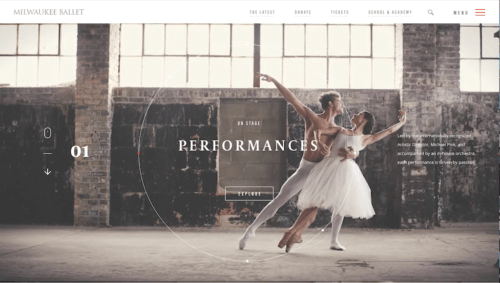
The front page of the Milwaukee Ballet site catches the eye with a beautiful video of rhythmic movements. The whole design of the site’s front page is a video, but not too crowded and heavy. In fact, it is precisely the stimulus that catches the attention of ballet lovers: beauty, skill, and movement.
But perhaps the best thing about this homepage is that the design and user experience have received the same amount of attention. Finding different sections of the site and using them (with the help of the search section) is easy, and the CTAs on the video slider are logical and clear.
Clearly valuable suggestions from your Home-Page to your audience
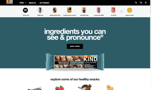
KIND Snacks gets high marks for its extremely balanced design and valuable offer. Immediately after entering the first page, a user realizes what sets the KIND website apart from other similar websites. In addition, the use of contrasting colors makes the whole page look prominent and quickly draws attention to the product photo and its slogan.
In the case of product images, the KIND chocolate bar image and the secondary CTA images show a level of quality and skill of front page designers that should be taken into account. They have done a great job in making the product stand out and attract attention.
The less the better
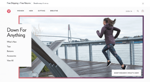
Remember that the design of the first page of your site does not have to reflect all the details of your website. In fact, it should only indicate one thing – a gateway to the rest of the site. Sometimes that means the less detail the better, just like the example of the Lululemon website.
This satisfying front page balances highlights and colors with a simple design and straightforward and easy navigation. There is no doubt about the actions that a user can perform with a specific purpose.
Lululemon covers everything from developing goods to various clothing and gift groups. They have also done a great job of providing a valuable offer at the top of the site to help reassure unsure buyers: Free shipping and free returns.
Final talk about Home-Page
A great front page attracts visitors and then keeps them on your site. This means that the focus of your front page should not be just on an interesting and beautiful design – it should try to make it easy to communicate your valuable offer to your audience.
But keep in mind that your front page is not motionless and dry, in fact it should not be at all! Your homepage should always be fresh and uplifting to delight and engage your users.
To make sure your front page does its job well, pay attention to how it works in Google Analytics. Especially to the bounce rate section, which determines whether people leave your site immediately after entering. If your site’s bounce rate is high, it may mean that visitors can not find what they are looking for, or that your valuable offer could not gain their trust and attention.
Most importantly you have to be flexible! If you think a job is missing, find it and fix the problem. In fact, get started now. Go to the first page of your site and specify a section that you can change and get started.
Pingback: 8 ways to earn money while you are asleep | 2021 Update - MyAdviseNow